
6th Grade > Mathematics
DATA HANDLING MCQs
Total Questions : 94
| Page 4 of 10 pages
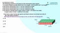
Question 31. The graph given below shows the marks of Ashish in the mid-term exam in 5 subjects.

Answer the following questions from the bar graph:
a) The bar graph gives information about what?
b) Give the name of subject in which Ashish scored maximum marks.
c) Give the name of subject in which Ashish scored minimum marks.
d) Give the name of the subjects with the marks.
[4 MARKS]
Answer the following questions from the bar graph:
a) The bar graph gives information about what?
b) Give the name of subject in which Ashish scored maximum marks.
c) Give the name of subject in which Ashish scored minimum marks.
d) Give the name of the subjects with the marks.
[4 MARKS]
:
Each option: 1 Mark
a) The bar graph gives information about the marks scored by Ashish in each subject.
b) Ashish scored maximum marks in Math. That is 90.
c) Ashish scored minimum marks in Social Science. That is 65.
d) Maths – 90
Science – 85
Hindi – 70
English – 80
Social Science – 65


:
Least: 1 Mark
Maximum: 1 Mark
As we can see from the above pictograph, the least number of trees are cut on Saturday = 2.
The maximum number of trees are cut on Thursday = 8.
Question 34. If the bar graph below represents your pocket money expenditure, what is the activity that takes most of your pocket money?
Here the horizontal axis (x-axis) represents activity and vertical axis (y-axis) represents expenditure. The scale for x-axis is 1 cm = 1 activity and for y-axis is 1 cm = ₹ 100.

Here the horizontal axis (x-axis) represents activity and vertical axis (y-axis) represents expenditure. The scale for x-axis is 1 cm = 1 activity and for y-axis is 1 cm = ₹ 100.
Answer: Option D. -> Gaming Centres
:
D
The height of the bar graph represents the amount spent for various activity. So, gaming centres expenses have the highest bar which indicates that the amount spent for that activity is largest.
:
D
The height of the bar graph represents the amount spent for various activity. So, gaming centres expenses have the highest bar which indicates that the amount spent for that activity is largest.

:
To find out how many people like different flavours, the representation given in Option 1 is difficult to use, as we have tocount the number of dots in the circles. Instead, we can use the table given inOption 2, where the number of people and theirfavourite flavours are tabulated.
Answer: Option A. -> True
:
A
In surveying, surveyors collect data by examining, observing people and situations. This gives them raw data.
:
A
In surveying, surveyors collect data by examining, observing people and situations. This gives them raw data.

Answer: Option B. -> B
:
B
We can see that Player B has the most number of balls in the pictograph i.e.8 balls. Hence, B is the top scorer as the number of balls in pictograph represents the number of goals scored by the player.
:
B
We can see that Player B has the most number of balls in the pictograph i.e.8 balls. Hence, B is the top scorer as the number of balls in pictograph represents the number of goals scored by the player.
Question 38. In the bar chart below, you have the sales of bikes from ABC company. What is the difference of sales in April and June?
Here the horizontal axis is x-axis which represents months and vertical axis is y-axis which represents number of bikes sold. The scale for x axis is 1 cm = 1 month and y-axis 1 cm = 5 bikes.

Here the horizontal axis is x-axis which represents months and vertical axis is y-axis which represents number of bikes sold. The scale for x axis is 1 cm = 1 month and y-axis 1 cm = 5 bikes.
Answer: Option A. -> 50 bikes
:
A
The height of the bar graph represents the sales in a month.
∴ Sales in April =35 units.
Sales in June =25 units.
So, the difference =35−25=10 units.
∴ Difference in sales=10×5=50
:
A
The height of the bar graph represents the sales in a month.
∴ Sales in April =35 units.
Sales in June =25 units.
So, the difference =35−25=10 units.
∴ Difference in sales=10×5=50
Answer: Option A. -> True
:
A
ABar Graph(also called Bar Chart) is a graphical display of data using bars of different heights.
In a bar graph, bars have uniform width and spacing between them.
If the spacing and width are not uniform, the bar graph is not correctly drawn.
:
A
ABar Graph(also called Bar Chart) is a graphical display of data using bars of different heights.
In a bar graph, bars have uniform width and spacing between them.
If the spacing and width are not uniform, the bar graph is not correctly drawn.
Question 40. The graph given below shows the sale of tee-shirts from Mon to Sat. [3 MARKS]

Answer the following questions from the bar graph:
a) What is the information given by the bar graph?
b) Which day have the maximum number of selling of tee shirts? How many tee shirts?
c) Give the number of tee shirts sold on Wednesday?
Answer the following questions from the bar graph:
a) What is the information given by the bar graph?
b) Which day have the maximum number of selling of tee shirts? How many tee shirts?
c) Give the number of tee shirts sold on Wednesday?
:
Each part: 1 Mark
a) The bar graph gives information of tee-shirts sold from Mon to Sat.
b) The maximum number of tee-shirts were sold on Saturday. That is 65.
c) The numbers of tee-shirts sold on Wednesday are 30.
Latest Videos


Latest Test Papers


Login With Google
Old way of Login
Login With Email