
6th Grade > Mathematics
DATA HANDLING MCQs
Total Questions : 94
| Page 7 of 10 pages
Answer: Option A. ->
True
:
A
:
A
A Bar Graph (also called Bar Chart) is a graphical display of data using bars of different heights.
In a bar graph, bars have uniform width and spacing between them.
If the spacing and width are not uniform, the bar graph is not correctly drawn.

Answer: Option B. ->
Saturday, 0.5
:
B
:
B
It is evident from the pictograph that the maximum number of guests came on Saturday i.e. 4 × 2 = 8 guests came on this day (1 picture represent 2 people).
On the previous day, i.e. Friday, number of guests = 2.5 × 2 = 5.
Therefore, difference = 8 - 5 = 3.
Answer: Option A. ->
True
:
A
:
A
In surveying, surveyors collect data by examining, observing people and situations. This gives them raw data.
Question 64.
If the bar graph below represents your pocket money expenditure, what is the activity that takes most of your pocket money?
Here the horizontal axis (x-axis) represents activity and vertical axis (y-axis) represents expenditure. The scale for x-axis is 1 cm = 1 activity and for y-axis is 1 cm = ₹ 100.

Answer: Option D. ->
Gaming Centres
:
D
:
D
The height of the bar graph represents the amount spent for various activity. So, gaming centres expenses have the highest bar which indicates that the amount spent for that activity is largest.
Answer: Option D. ->
Gaming Centres
:
:
Let us arrange the following data in ascending order.
2,3,3,4,6,7,7,8,9,10.
We can clearly see from the above data that five students have marks greater than 6.
Answer: Option D. ->
Gaming Centres
:
:
Each part: 1 Mark
a) Black coloured car is most liked by the customers. It is the highest selling product among all the colours.
b) Total number of cars sold = (15 + 20 + 17 + 12 + 9) = 73.
Answer: Option D. ->
Gaming Centres
:
:
Frequency: 1 Mark
Maximum and minimum: 1 Mark
The frequency of an observation in a data set is the number of times that observation has occurred in a data set. It is basically the total count of that observation in that data-set.
2 has the maximum frequency as it occurred four times.
3 has the minimum frequency as it occurred once only
Question 68.
Suppose one makes a survey of 20 families in the colony and find out the number of children in each family. The number of children in each family are 2, 2, 2, 3, 1, 1, 2, 3, 2, 2, 1, 2, 2, 3, 1, 2, 1, 1, 3, 2 .State the frequency of each observation and also draw the tally chart. [3 MARKS]


Answer: Option D. ->
Gaming Centres
:
:
Each part: 1 Mark
The various inferences that we can draw from the above bar graph are:
In 1989 100 books were sold.
In 1990 200 books were sold.
In 1991 600 books were sold.
In 1992 300 books were sold.
In 1993 400 books were sold.
a) As we can see from the above bar graph, 200 books were sold in 1990.
b) In 1989, 100 books were sold.
c) Number of books sold in 1993 = 400
Number of books sold in 1992 = 300
∴ The difference in the number of books sold in 1993 and 1992 = 400 - 300 = 100.

Answer: Option D. ->
Gaming Centres
:
:
Each part: 1 Mark
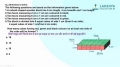
a) The bar graph shows the total rainfall (in mm) in a city in different years. [ From 2007 to 2012]
b) Just by inspection, we can find that rainfall was maximum in the year 2012. The bar corresponding to the year 2012 is having maximum height.
c) Minimum rainfall was in the year 2011. The bar corresponding to the year 2011 is having minimum height.
d) 550 mm of rainfall was recorded in the year 2007.
Latest Videos


Latest Test Papers


Login With Google
Old way of Login
Login With Email