
6th Grade > Mathematics
DATA HANDLING MCQs
Total Questions : 94
| Page 6 of 10 pages
Answer: Option B. ->
False
:
B
:
B
Data is a collection of facts such as numbers, words, measurements, observations or even just descriptions of things while information is something that we get when we analyse data. Thus, data and information are not the same.

Answer: Option B. ->
VI 'B'
:
B
:
B
Class VI 'B' has arranged the marks in ascending order as
08 < 12 < 15 < 20 < 45 < 67 < 78 < 88 < 90 < 95

Answer: Option B. ->
False
:
B
This statement is false. The information which can be represented by a bar graph can be represented by a pictograph too. However, the preference may vary depending upon convenience and the context.
:
B
This statement is false. The information which can be represented by a bar graph can be represented by a pictograph too. However, the preference may vary depending upon convenience and the context.
Answer: Option A. ->
Data is collection of numbers.
:
A and B
:
A and B
A data is a collection of numbers gathered to give some information. It should be noted that data and information are not the same thing.

Answer: Option B. ->
B
:
B
:
B
We can see that Player B has the most number of balls in the pictograph i.e. 8 balls. Hence, B is the top scorer as the number of balls in pictograph represents the number of goals scored by the player.

Answer: Option B. ->
B
:
:
To find out how many people like different flavours, the representation given in Option 1 is difficult to use, as we have to count the number of dots in the circles. Instead, we can use the table given in Option 2, where the number of people and their favourite flavours are tabulated.
Answer: Option C. ->
C
:
C
The data in table C is organised.
It is organised in ascending order.
We can easily answer the questions asked from the data in table C as compared to other data sets.
Also, when the number of students is more, it's almost impossible to analyse the data if it is not organised.
If we store it in alphabetical order, it is hard to determine who scored the least marks or who scored the highest marks.
So A is not always the best way to organise for easy analysis.
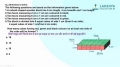
Question 59.
In the bar chart below, you have the sales of bikes from ABC company. What is the difference of sales in April and June?
Here the horizontal axis is x-axis which represents months and vertical axis is y-axis which represents number of bikes sold. The scale for x axis is 1 cm = 1 month and y-axis 1 cm = 5 bikes.

Answer: Option A. ->
50 bikes
:
A
:
A
The height of the bar graph represents the sales in a month.
∴ Sales in April =35 units.
Sales in June =25 units.
So, the difference =35−25=10 units.
∴ Difference in sales =10×5=50
Answer: Option A. ->
They represent data through pictures
:
A, C, and D
:
A, C, and D
A pictograph represents data through pictures of objects. It helps answer the questions on the data at a glance. They can be applied to any data set, but it can be difficult in some specific cases. Suppose if you have to represent sales of cars for a company in a year, it will be so difficult to represent data like 39837 or 30001, using pictures.
Latest Videos


Latest Test Papers


Login With Google
Old way of Login
Login With Email