
Exams > Cat > Di And Lr
BASIC DI MCQs
Total Questions : 73
| Page 7 of 8 pages
Answer: Option D. -> Cannot be determined
:
D
From the given information we can not find out exact number of lawyers.
:
D
From the given information we can not find out exact number of lawyers.
Answer: Option C. -> 450%
:
C
Production in 1981= 0.6 bn tones
Production in 2010= 3.24 bn tones
Factor of Multiplication = 3.250.6 ≈ 5.5
Hence, percentage increase= (FOM-1)×100≈450%
:
C
Production in 1981= 0.6 bn tones
Production in 2010= 3.24 bn tones
Factor of Multiplication = 3.250.6 ≈ 5.5
Hence, percentage increase= (FOM-1)×100≈450%
Answer: Option D. -> 1992
:
D
On observing the graph closely, the question is about the parallelism of the two curves. We are being asked about the period in which the line graph for tea and coffee is most parallel. This happens for the year 1992.
:
D
On observing the graph closely, the question is about the parallelism of the two curves. We are being asked about the period in which the line graph for tea and coffee is most parallel. This happens for the year 1992.
Answer: Option D. -> 1995 and 1996
:
D
Total exports of the three Companies X, Y and Z together, during various years are:
In 1993 = Rs. (30 + 80 + 60) crores = Rs. 170 crores.
In 1994 = Rs. (60 + 40 + 90) crores = Rs. 190 crores.
In 1995 = Rs. (40 + 60 + 120) crores = Rs. 220 crores.
In 1996 = Rs. (70 + 60 + 90) crores = Rs. 220 crores.
In 1997 = Rs. (100 + 80 + 60) crores = Rs. 240 crores.
In 1998 = Rs. (50 + 100 + 80) crores = Rs. 230 crores.
In 1999 = Rs. (120 + 140 + 100) crores = Rs. 360 crores.
Clearly, the total exports of the three Companies X, Y and Z together are same during the years 1995 and 1996.
Answer: Option C. -> 5
:
C
Except for Middle East & Africa, all regions witness “SO” Economic Sentiment. One possible mistake that you can make here is, you might include “overall” region in your answer. That has to be avoided.
:
C
Except for Middle East & Africa, all regions witness “SO” Economic Sentiment. One possible mistake that you can make here is, you might include “overall” region in your answer. That has to be avoided.
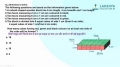
Answer: Option A. -> 240 mn
:
A
Dell’s revenue in 2011 was 180mn. Then HP’s revenue in 2011 was 360mn and HP’s revenue grew at 50% from 2009 to 2011. So, HP’s revenue in 2009 = 240mn
DELL'S REVENUE YEAR WISE
2008200920102011
100120150180
↖↗
50% Increase
:
A
Dell’s revenue in 2011 was 180mn. Then HP’s revenue in 2011 was 360mn and HP’s revenue grew at 50% from 2009 to 2011. So, HP’s revenue in 2009 = 240mn
DELL'S REVENUE YEAR WISE
2008200920102011
100120150180
↖↗
50% Increase
Answer: Option D. -> 2001
:
D
The percentage changes are:
For 2000 = 141−78141 = 44.6%
For 2002 = 159−120120 = 32.5%
For 1999 = 141−9999 = 42.4%
For 2001 = 120−7878 = 53.8%
:
D
The percentage changes are:
For 2000 = 141−78141 = 44.6%
For 2002 = 159−120120 = 32.5%
For 1999 = 141−9999 = 42.4%
For 2001 = 120−7878 = 53.8%
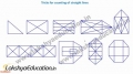
Question 68. In the figure shown here, there are 5 different shapes (A to E). Each shape represents the population of a village and the population is directly proportional to the area of that shape. (for eg, the population of village A is proportional to the area of shape A)

Now, assume that we want to draw a line graph to depict the population variation between the given villages. We have shown the line graph here in two of the possible ways (I and II). Which of these depicts the variation more accurately?

Now, assume that we want to draw a line graph to depict the population variation between the given villages. We have shown the line graph here in two of the possible ways (I and II). Which of these depicts the variation more accurately?
Answer: Option A. -> I only
:
A
Here the approach should be to eliminate the wrong answers. This way we will be able tom save time.
Let’s analyze curve II:
This shows min population for Village C, whereas the minimum is for E. Thus not possible.
Curve III:
In reality Village C has higher population than Village B. But this curve shows the reverse. Thus not possible.
Curve I:
It shows no deviation from the expected. Thus the answer.
Answer: Option B. -> Middle East & Africa
:
B
For Middle east & Africa, there is a continuous increase. Therefore, it satisfies the criteria for VO.
:
B
For Middle east & Africa, there is a continuous increase. Therefore, it satisfies the criteria for VO.
Answer: Option D. -> 1992
:
D
For 1991, it’s easy to say that the growth is negative. And between 1990 and 1992, it’s easy to observe that 1992 has witnessed a higher growth as compared to the previous year.
:
D
For 1991, it’s easy to say that the growth is negative. And between 1990 and 1992, it’s easy to observe that 1992 has witnessed a higher growth as compared to the previous year.
Latest Videos


Latest Test Papers


Login With Google
Old way of Login
Login With Email