
Question
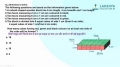
In the figure shown here, there are 5 different shapes (A to E). Each shape represents the population of a village and the population is directly proportional to the area of that shape. (for eg, the population of village A is proportional to the area of shape A)

Now, assume that we want to draw a line graph to depict the population variation between the given villages. We have shown the line graph here in two of the possible ways (I and II). Which of these depicts the variation more accurately?

Now, assume that we want to draw a line graph to depict the population variation between the given villages. We have shown the line graph here in two of the possible ways (I and II). Which of these depicts the variation more accurately?
Answer: Option A
:
A
Here the approach should be to eliminate the wrong answers. This way we will be able tom save time.
Let’s analyze curve II:
This shows min population for Village C, whereas the minimum is for E. Thus not possible.
Curve III:
In reality Village C has higher population than Village B. But this curve shows the reverse. Thus not possible.
Curve I:
It shows no deviation from the expected. Thus the answer.
Was this answer helpful ?
More Questions on This Topic :

Latest Videos


Latest Test Papers


Submit Solution