Sail E0 Webinar

8th Grade > Mathematics

INTRODUCTION TO GRAPHS MCQs

Total Questions : 60 | Page 6 of 6 pages
Question 51.


I buy apples,  grapes and bananas for 2 days. I want to compare their prices using a graph. What type of graph should I use? 


I Buy Apples,  Grapes And Bananas For 2 Days. I Want To Com...


  1.     Line graph
  2.     Single bar graph
  3.     Histogram
  4.     Double bar graph
 Discuss Question
Answer: Option D. -> Double bar graph
:
D

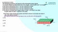
A double bar graph is a graphical display of information using two bars beside each other at various heights.


The bars can be arranged vertically or horizontally.


We can use a double bar graph to compare two data groups. A double bar graph has two axes.


So, here a double bar graph can be used, one set of graphs for each of the 2 days.


Question 52.


The bar graph shows the usual method of transport to school for the students in a class. How many students are there altogether in the class?


The Bar Graph Shows The Usual Method Of Transport To School ...


  1.     20
  2.     21
  3.     22
  4.     23
 Discuss Question
Answer: Option C. -> 22
:
C

5 students uses bus


3 students uses bike


1 student uses taxi


2 students uses train


6 students uses car


5 students walk to school


Total number of students = 5 + 1 + 3 + 2 + 6 +5 = 22


Question 53.


The type of graph which should be used to represent the given data is a 


___

Weights(Kg)40454550505555606065No. of Person4121365.


 Discuss Question
Answer: Option C. -> 22
:

The given data are grouped into classes. Hence the graph that should be used to represent them is histogram.


Question 54.


The bar graph shows the favourite colours of 20 students in a class. How many more of them favoured blue than pink?


The Bar Graph Shows The Favourite Colours Of 20 Students In ...


  1.     5
  2.     2
  3.     3
  4.     4
 Discuss Question
Answer: Option C. -> 3
:
C

6 of them favored blue and 3 favored pink.


6 − 3 = 3 .


Therefore 3 more favored blue than pink.


Question 55.


The given table shows daily temperatures for Delhi, recorded for 6 days, in degrees Celsius. Plot a line graph. Which of the following statements is true.
(Temperature in Delhi)DayTemperature16C212C310C414C515C619C


  1.     All the points lie on a common straght line
  2.     The temperature on a given day is never lower than that of the previous day
  3.     The highest temperature is on the 6th day
  4.     None of These
 Discuss Question
Answer: Option C. -> The highest temperature is on the 6th day
:
C

The given table shows daily temperatures for Delhi, ...
The graph is as shown above. From the graph, it can be observed that the points do not form a straight line. It can be seen that the temperature is the highest on day 6.


Question 56.


Suppose a medium pizza was eaten by you and your 7 friends. As you were still hungry, you ordered a large pizza this time. The large pizza is again cut into 8 equal parts. The percentage of full large pizza eaten by you is:


Suppose A medium Pizza Was Eaten By You And your 7 Friends...


  1.     the same as that of the medium pizza
  2.     less than that of the medium pizza 
  3.     more than that of the medium pizza
  4.     can't be determined
 Discuss Question
Answer: Option A. -> the same as that of the medium pizza
:
A

We can see this example as a type of pie chart. The medium pizza is a small pie chart, which is divided into 8 equal parts. So, the percentage of pizza eaten by you is 18x100. Similarly, in the large pizza a similar pie chart is depicted. This is again divided into 8 equal parts, the percentage of large pizza eaten by you is  18x100. So, the percentage of large pizza eaten by you will be same as percentage of medium pizza eaten by you. 


Question 57.


The line graph below shows people in a store at various times of the day.
What is the busiest time of the day at the store?


The Line Graph Below Shows People In A Store At Various Time...


  1.     1 pm
  2.     2 pm
  3.     3 pm
  4.     11 am
 Discuss Question
Answer: Option A. -> 1 pm
:
A

From graph it can be seen that number of people in the store is highest at 1 pm.


Question 58.


Three points A (4, 2), B (3, 3 ) and C ( 2,4 ) will lie on the straight line.


  1.     True
  2.     False
  3.     Pie chart
  4.     All of these
 Discuss Question
Answer: Option A. -> True
:
A

After plotting point A, B and C on the graph. We will get a straight line.


Three Points A (4, 2), B (3, 3 ) And C ( 2,4 ) Will Lie On T...


Question 59.


In CAT exam, Kevin scored 98% in the first attempt, 82% in the second attempt and 95% in the third attempt. This data can be best represented by


  1.     Bar graph
  2.     Line graph
  3.     Pie chart
  4.     All of these
 Discuss Question
Answer: Option B. -> Line graph
:
B

Line graph can represent data that continuously changes with time because a line graph is such that for each and every value of time, a value of the datum can be obtained. For example, if my temperature is continuously changing with time, using a line graph my temperature at any time can be shown.


Question 60.


A point whose y-coordinate is zero and x-coordinate is 9 will lie on x -axis.


  1.     True
  2.     False
  3.     Pie chart
  4.     All of these
 Discuss Question
Answer: Option A. -> True
:
A

x-coordinate is the distance of point from y-axis and y-coordinate is the distance of point from x-axis. Since, y-coordinate is 0, the distance of point from x-axis will be zero which means the point will lie on x-axis.


Latest Videos

Latest Test Papers