
8th Grade > Mathematics
INTRODUCTION TO GRAPHS MCQs
Total Questions : 60
| Page 2 of 6 pages

Answer: Option B. -> False
:
B
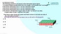
The x-axispoint of A = 3
The y-axispoint of A = 4
Hence, the coordinates of point A = (3, 4)
:
B
The x-axispoint of A = 3
The y-axispoint of A = 4
Hence, the coordinates of point A = (3, 4)
Answer: Option B. -> 10
:
B
The width of the bar should be equivalent to 5 kg since this is the class interval. But 1 kg equates to 2 units in thex-axis. Hence the width of each baris 5 × 2 = 10 units.
:
B
The width of the bar should be equivalent to 5 kg since this is the class interval. But 1 kg equates to 2 units in thex-axis. Hence the width of each baris 5 × 2 = 10 units.
Question 13. Plot the line graph for this data. Which of the following statement is true?
Sarah brought a new car in 2001 for ₹8,00,000. The value of her car changed each year as shown in the table below.
(Values of Sarah′s car)YearValue2001₹8,00,0002002₹7,50,0002003₹6,60,0002004₹5,80,0002005₹4,80,0002006₹3,30,0002007₹1,90,000
Sarah brought a new car in 2001 for ₹8,00,000. The value of her car changed each year as shown in the table below.
(Values of Sarah′s car)YearValue2001₹8,00,0002002₹7,50,0002003₹6,60,0002004₹5,80,0002005₹4,80,0002006₹3,30,0002007₹1,90,000


Answer: Option C. -> 50%
:
C
The sum of the percentages of all parts of a pie chart should add up to 100. The sum of percentages of types of channels other than entertainment adds up to 25 + 15 + 10 =50%. Hence the remaining % for entertainment is 50%.
:
C
The sum of the percentages of all parts of a pie chart should add up to 100. The sum of percentages of types of channels other than entertainment adds up to 25 + 15 + 10 =50%. Hence the remaining % for entertainment is 50%.

Answer: Option A. -> True
:
A
The total number of students who voted is the sum of the number of votes for each fruit. This is 5+3+2+4+1+4=19.
:
A
The total number of students who voted is the sum of the number of votes for each fruit. This is 5+3+2+4+1+4=19.
Answer: Option A. -> comparison among categories
:
A
Abargraphis a chart that presents data with rectangularbars for different categories. The bars have lengths proportional to the values that they represent.
:
A
Abargraphis a chart that presents data with rectangularbars for different categories. The bars have lengths proportional to the values that they represent.
Answer: Option B. -> The data is grouped.
:
B
Ahistogramis a representationof continuousdata that are grouped into classes.There are no gaps between the bars in a histogram becausethe classes are continuous.
:
B
Ahistogramis a representationof continuousdata that are grouped into classes.There are no gaps between the bars in a histogram becausethe classes are continuous.

Answer: Option D. -> 40
:
D
From the given line graph, we have:
The runs scored by batsman′3′=10
The runs scored by batsman′5′=50
∴ requireddifference in scores=(50−10)=40
:
D
From the given line graph, we have:
The runs scored by batsman′3′=10
The runs scored by batsman′5′=50
∴ requireddifference in scores=(50−10)=40

Answer: Option A. -> 300 ppm
:
A
From pie chart, we can see that the content of carbon dioxide is 25% which is equal to 500 ppm.
So, total gas present in the atmosphere =500×10025 = 2000 ppm
Oxygen content is 15% =2000×15100 = 300 ppm.
:
A
From pie chart, we can see that the content of carbon dioxide is 25% which is equal to 500 ppm.
So, total gas present in the atmosphere =500×10025 = 2000 ppm
Oxygen content is 15% =2000×15100 = 300 ppm.
Answer: Option A. -> Mangoes, Oranges
:
A
From thegraph, it can be observed that number of students who like oranges and mangoes is 4.
In this case, lengths of bars corresponding to mangoes and oranges are same.
:
A
From thegraph, it can be observed that number of students who like oranges and mangoes is 4.
In this case, lengths of bars corresponding to mangoes and oranges are same.
Latest Videos


Latest Test Papers


Login With Google
Old way of Login
Login With Email