
8th Grade > Mathematics
INTRODUCTION TO GRAPHS MCQs
Total Questions : 60
| Page 4 of 6 pages
Question 31.
Students in Mrs. Smeera's class were surveyed about snacks and asked to choose one snack they liked most from a list. The bar graph below summarizes the data collected from this survey. 
Assuming that one student likes only one of the given snacks, ___ percentage of students liked mixture.
Answer: Option A. ->
:
:
The total number of students are 22. The number of students who like the mixture is 2. The percentage of students who like mixture is 222×100 = 9.1%.
Answer: Option D. ->
Papaya
:
D
:
D
The graph depicts the sales of each fruit on Monday and Tuesday. The height of the bars quantify the sales for that particular fruit on these days. We need to look for the fruit which has the same bar height corresponding to Monday and Tuesday.
We can see that papaya has sales of 22.5 kg on both Monday and Tuesday.

Answer: Option C. ->
10
:
C
:
C
In the figure, the x-axis represents the time and y-axis represents the number of people. In a line graph, the value of datum at any point can be found using the line. The time 2:30 pm is exactly halfway between 2 and 3 pm. The number of people is on the y-axis corresponding to the point between that at 2 and 3. Halfway between 5 and 15 on a number line is 10. Hence the number of people at 2:30 pm are 10.
Answer: Option B. ->
10
:
B
:
B
The width of the bar should be equivalent to 5 kg since this is the class interval. But 1 kg equates to 2 units in the x-axis. Hence the width of each bar is 5 × 2 = 10 units.
Answer: Option B. ->
Line graph
:
B
:
B
A line graph is most suitable if we take regular readings at small time intervals. Using the given intermediate points, readings can be estimated at any given time in the period.
Answer: Option B. ->
1
:
B
:
B
The height of the bars quantify the sales for that particular fruit on Monday and Tuesday. We need to look for the fruits for which the bars corresponding to Monday have more height than those for Tuesday.
We can see that banana is the only fruit for which sales on Monday is more than that on Tuesday.
Question 37.
Plot the line graph for this data. Which of the following statement is true?
Sarah brought a new car in 2001 for ₹8,00,000. The value of her car changed each year as shown in the table below.
(Values of Sarah′s car)YearValue2001₹8,00,0002002₹7,50,0002003₹6,60,0002004₹5,80,0002005₹4,80,0002006₹3,30,0002007₹1,90,000

Answer: Option B. ->
The sale value of car is always reducing with time
:
:
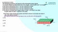
We need two pieces of data to represent any point on a two-dimensional plane. The position of any point in two-dimensional space is given by an ordered pair of real numbers, each number giving the distance of that point from the origin measured along the given axis, which is equal to the distance of that point from the other axis.

Answer: Option B. ->
False
:
B
:
B
The x-axis point of A = 3
The y-axis point of A = 4
Hence, the coordinates of point A = (3, 4)
Answer: Option C. ->
50%
:
C
:
C
The sum of the percentages of all parts of a pie chart should add up to 100. The sum of percentages of types of channels other than entertainment adds up to 25 + 15 + 10 = 50%. Hence the remaining % for entertainment is 50%.
Latest Videos


Latest Test Papers


Login With Google
Old way of Login
Login With Email