Sail E0 Webinar

8th Grade > Mathematics

INTRODUCTION TO GRAPHS MCQs

Total Questions : 60 | Page 5 of 6 pages
Question 41.


Students in a class voted on their favorite fruit. Each student voted once. The bar graph below summarizes the data collected from the class vote. The total number of students who voted is 19.


Students In A Class Voted On Their Favorite Fruit. Each Stud...


  1.     True
  2.     False
 Discuss Question
Answer: Option A. -> True
:
A

The total number of students who voted is the sum of the number of votes for each fruit. This is 5+3+2+4+1+4=19.


Question 42.


A bar graph is used to show ____________.


  1.     comparison among categories
  2.     comparison among pictures only
  3.     comparison among data in intervals
  4.     Percentage difference between two quantities
 Discuss Question
Answer: Option A. -> comparison among categories
:
A

A bar graph is a chart that presents data with rectangular bars for different categories. The bars have lengths proportional to the values that they represent. 


Question 43.


What is the difference between runs scored by batsmen '3' and '5'?


What Is The Difference Between runs Scored by Batsmen '3' ...


  1.     10
  2.     20
  3.     30
  4.     40
 Discuss Question
Answer: Option D. -> 40
:
D

From the given line graph, we have:
The runs scored by batsman 3=10


The runs scored by batsman  5=50
required difference in scores =(5010)=40


Question 44.


Why are there no gaps between bars in a histogram?


  1.     The graph must look symmetric.
  2.     The data is grouped.
  3.     It is the followed convention.
  4.     It is easy to compare.
 Discuss Question
Answer: Option B. -> The data is grouped.
:
B

A histogram is a representation of continuous data that are grouped into classes. There are no gaps between the bars in a histogram because the classes are continuous.


Question 45.


A graph which displays data that changes continuously over a period of time is __ graph.


 Discuss Question
Answer: Option B. -> The data is grouped.
:

A line graph can be used to display data that changes continuously over a period of time.


Question 46.


Which two fruits are liked by equal number of students?


Which Two fruits Are Liked By Equal Number Of Students?


  1.     Mangoes, Oranges
  2.     Pears, Grapes
  3.     Bananas, Oranges
  4.     Apples, Mangoes
 Discuss Question
Answer: Option A. -> Mangoes, Oranges
:
A

From the graph, it can be observed that number of students who like oranges and mangoes is 4.
In this case, lengths of bars corresponding to mangoes and oranges are same.


Question 47.


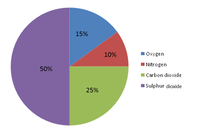
The content of the carbon dioxide in the air is 500 ppm(parts per million). What is the content of Oxygen in the air ?


The Content Of The Carbon Dioxide In The Air Is 500 Ppm(part...


  1.     300 ppm
  2.     150 ppm
  3.     200 ppm
  4.     None of these
 Discuss Question
Answer: Option A. -> 300 ppm
:
A

From pie chart, we can see that the content of carbon dioxide is 25% which is equal to 500 ppm.


So, total gas present in the atmosphere = 500×10025 = 2000 ppm


Oxygen content is 15% = 2000×15100 = 300 ppm.


Question 48.


Two points A & B are plotted on a graph with coordinates (2,3) and (3,2) respectively. The points A and B will coincide.


  1.     True
  2.     False
  3.     4 cm
  4.     2 cm
 Discuss Question
Answer: Option B. -> False
:
B

For point A, X-coordinate= 2 Y-coordinate=3


For point B , X-coordinate = 3 Y-coordinate=2


Hence, they will not coincide. 


Question 49.


Representation of data in form of sectors of a circle is called __ chart.


 Discuss Question
Answer: Option B. -> False
:

Representation of data in form of sectors of a circle is called pie chart.


Question 50.


Find the perimeter of the square?


Find The Perimeter Of The Square?


  1.     16 cm
  2.     8 cm
  3.     4 cm
  4.     2 cm
 Discuss Question
Answer: Option B. -> 8 cm
:
B

Perimeter of the square =4a (where a is length of side)


Length of side of square = 2 cm


Perimeter of the square = 4 × 2= 8 cm


Latest Videos

Latest Test Papers