
Question
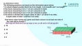
The graph below shows the usage of graph types in a school. Choose the correct options on basis of data given.

Answer: Option C
:
C and D
Was this answer helpful ?
:
C and D
Line graphs are the most favoured graphs in the school as it has the highest value on the Y-axis of 9.Frequency polygon is the least favoured as it has the smallest value of just 1.
Was this answer helpful ?
More Questions on This Topic :

Latest Videos


Latest Test Papers


Submit Solution