
Question
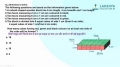
In the graph shown here, for how many countries the organ donations by ‘Living’ surpasses organ donations by ‘Deceased’?

Answer: Option B
:
B
For most of the countries, you can eliminate just by looking at the graph (E.g., Countries like Spain and Italy can be eliminated directly). The countries for which it is not so easy to figure out the exact answer just by plain observation, the following approach can be used.
Step 1- consider any country’s data. Now find out the total organ donations. For example, for Portugal it is 35.
Step 2 Divide 35 by 2; this will give you 17.5. Draw a divider line at the 17.5 mark as shown.

Step 3 - Now you just need to see if the data for ‘Deceased’ surpasses the 17.5 mark or not. If it surpasses, then this country’s data doesn’t match our requirement. Now move to the next country.
This way, we will find that the countries that satisfy the condition given are Britain, Canada, Netherlands, Sweden, Turkey and Mexico. Thus 6 countries in all.
Was this answer helpful ?
:
B
For most of the countries, you can eliminate just by looking at the graph (E.g., Countries like Spain and Italy can be eliminated directly). The countries for which it is not so easy to figure out the exact answer just by plain observation, the following approach can be used.
Step 1- consider any country’s data. Now find out the total organ donations. For example, for Portugal it is 35.
Step 2 Divide 35 by 2; this will give you 17.5. Draw a divider line at the 17.5 mark as shown.
Step 3 - Now you just need to see if the data for ‘Deceased’ surpasses the 17.5 mark or not. If it surpasses, then this country’s data doesn’t match our requirement. Now move to the next country.
This way, we will find that the countries that satisfy the condition given are Britain, Canada, Netherlands, Sweden, Turkey and Mexico. Thus 6 countries in all.
Was this answer helpful ?
More Questions on This Topic :

Latest Videos


Latest Test Papers


Submit Solution