Question
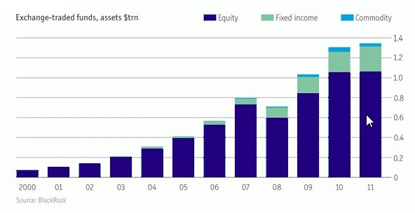
In the bar graph shown here, the ratio of ŌĆśExchange-traded funds (Commodity)ŌĆÖ to ŌĆśExchange-traded funds (Fixed Income)ŌĆÖ was highest for which of the following years?


Answer: Option B
:
B
Just by observation, you can be sure that 2008 can be eliminated. Now among 2010 and 2011, the ŌĆśEquityŌĆÖ part is same for both of them. To have a higher ratio value, the ŌĆścommodityŌĆÖ part should be higher and ŌĆśFixed IncomeŌĆÖ part should be lower. Thus among these two years, we can again eliminate 2011. The following table will give you the approximate value for years 2009 & 2010.
YearCommodityFixedIncomeRatio20090.040.200.2020100.020.160.125
We can see that the ŌĆścommodityŌĆÖ for 2010 is almost double that of ŌĆś2009ŌĆÖ whereas the ŌĆśfixed incomeŌĆÖ part doesnŌĆÖt have that much variation. Thus 2009 is the answer.
Was this answer helpful ?


Submit Solution